Rect
The <Rect> component is used to draw a rectangle.
NOTE
This component is supported since API version 7. Updates will be marked with a superscript to indicate their earliest API version.
Child Components
Not supported
APIs
Rect(value?: {width?: string | number,height?: string | number,radius?: string | number | Array<string | number>} | {width?: string | number,height?: string | number,radiusWidth?: string | number,radiusHeight?: string | number})
Parameters
| Name | Type | Mandatory | Default Value | Description |
|---|---|---|---|---|
| width | string | number | No | 0 | Width. |
| height | string | number | No | 0 | Height. |
| radius | string | number | Array<string | number> | No | 0 | Radius of the rounded corner. You can set separate radiuses for four rounded corners. |
| radiusWidth | string | number | No | 0 | Width of the rounded corner. |
| radiusHeight | string | number | No | 0 | Height of the rounded corner. |
Attributes
In addition to the universal attributes, the following attributes are supported.
| Name | Type | Default Value | Description |
|---|---|---|---|
| radiusWidth | string | number | 0 | Width of the rounded corner. The width and height are the same when only the width is set. |
| radiusHeight | string | number | 0 | Height of the rounded corner. The width and height are the same only when the height is set. |
| radius | string | number | Array<string | number> | 0 | Radius of the rounded corner. You can set separate radiuses for four rounded corners. |
| fill | ResourceColor | Color.Black | Color of the fill area. |
| fillOpacity | number | string | Resource | 1 | Opacity of the fill area. |
| stroke | ResourceColor | - | Stroke color. If this attribute is not set, the component does not have any stroke. |
| strokeDashArray | Array<Length> | [] | Stroke dashes. |
| strokeDashOffset | number | string | 0 | Offset of the start point for drawing the stroke. |
| strokeLineCap | LineCapStyle | LineCapStyle.Butt | Cap style of the stroke. |
| strokeLineJoin | LineJoinStyle | LineJoinStyle.Miter | Join style of the stroke. |
| strokeMiterLimit | number | string | 4 | Limit value when the sharp angle is drawn as a miter. |
| strokeOpacity | number | string | Resource | 1 | Stroke opacity. NOTE The value range is [0.0, 1.0]. If the set value is less than 0.0, 0.0 will be used. If the set value is greater than 1.0, 1.0 will be used. |
| strokeWidth | Length | 1 | Stroke width. |
| antiAlias | boolean | true | Whether anti-aliasing is enabled. |
Example
// xxx.ets
@Entry
@Component
struct RectExample {
build() {
Column({ space: 10 }) {
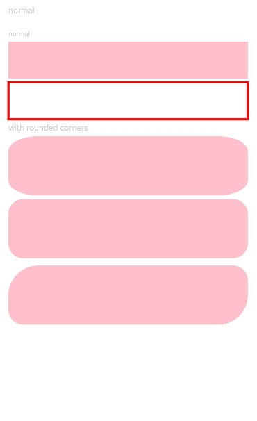
Text('normal').fontSize(11).fontColor(0xCCCCCC).width('90%')
// Draw a 90% x 50 rectangle.
Column({ space: 5 }) {
Text('normal').fontSize(9).fontColor(0xCCCCCC).width('90%')
// Draw a 90% x 50 rectangle.
Rect({ width: '90%', height: 50 })
.fill(Color.Pink)
// Draw a 90% x 50 rectangle.
Rect()
.width('90%')
.height(50)
.fillOpacity(0)
.stroke(Color.Red)
.strokeWidth(3)
Text('with rounded corners').fontSize(11).fontColor(0xCCCCCC).width('90%')
// Draw a 90% x 80 rectangle, with the width and height of its rounded corners being 40 and 20, respectively.
Rect({ width: '90%', height: 80 })
.radiusHeight(20)
.radiusWidth(40)
.fill(Color.Pink)
// Draw a 90% x 80 rectangle, with the width and height of its rounded corners being both 20.
Rect({ width: '90%', height: 80 })
.radius(20)
.fill(Color.Pink)
}.width('100%').margin({ top: 10 })
// Draw a 90% x 50 rectangle, with the width and height of its rounded corners as follows: 40 for the upper left rounded corner, 20 for the upper right rounded corner, 40 for the lower right rounded corner, and 20 for the lower left rounded corner.
Rect({ width: '90%', height: 80 })
.radius([[40, 40], [20, 20], [40, 40], [20, 20]])
.fill(Color.Pink)
}.width('100%').margin({ top: 5 })
}
}