# Rating
提供在给定范围内选择评分的组件。
> **说明:**
>
> 该组件从API Version 7开始支持。后续版本如有新增内容,则采用上角标单独标记该内容的起始版本。
## 子组件
无
## 接口
Rating(options?: { rating: number, indicator?: boolean })
**参数:**
| 参数名 | 参数类型 | 必填 | 参数描述 |
| -------- | -------- | -------- | -------- |
| rating | number | 是 | 设置并接收评分值。
默认值:0 |
| indicator | boolean | 否 | 设置评分组件作为指示器使用,不可改变评分。
默认值:false, 可进行评分 |
## 属性
| 名称 | 参数类型 | 描述 |
| -------- | -------- | -------- |
| stars | number | 设置评星总数。
默认值:5 |
| stepSize | number | 操作评级的步长。
默认值:0.5 |
| starStyle | {
backgroundUri: string,
foregroundUri: string,
secondaryUri?: string
} | backgroundUri:未选中的星级的图片链接,可由用户自定义或使用系统默认图片,仅支持本地图片。
foregroundUri:选中的星级的图片路径,可由用户自定义或使用系统默认图片,仅支持本地图片。
secondaryUir:部分选中的星级的图片路径,可由用户自定义或使用系统默认图片,仅支持本地图片。 |
## 事件
| 名称 | 功能描述 |
| -------- | -------- |
| onChange(callback:(value: number) => void) | 操作评分条的评星发生改变时触发该回调。 |
## 示例
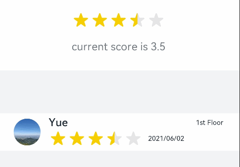
```ts
// xxx.ets
@Entry
@Component
struct RatingExample {
@State rating: number = 3.5
build() {
Column() {
Column() {
Rating({ rating: this.rating, indicator: false })
.stars(5)
.stepSize(0.5)
.margin({ top: 24 })
.onChange((value: number) => {
this.rating = value
})
Text('current score is ' + this.rating)
.fontSize(16)
.fontColor('rgba(24,36,49,0.60)')
.margin({ top: 16 })
}.width(360).height(113).backgroundColor('#FFFFFF').margin({ top: 68 })
Row() {
Image('common/testImage.jpg')
.width(40)
.height(40)
.borderRadius(20)
.margin({ left: 24 })
Column() {
Text('Yue')
.fontSize(16)
.fontColor('#182431')
.fontWeight(500)
Row() {
Rating({ rating: 3.5, indicator: true }).margin({ top: 1, right: 8 })
Text('2021/06/02')
.fontSize(10)
.fontColor('#182431')
}
}.margin({ left: 12 }).alignItems(HorizontalAlign.Start)
Text('1st Floor')
.fontSize(10)
.fontColor('#182431')
.position({ x: 295, y: 8 })
}.width(360).height(56).backgroundColor('#FFFFFF').margin({ top: 64 })
}.width('100%').height('100%').backgroundColor('#F1F3F5')
}
}
```