# Dynamic UI Element Building
After you've created a custom component (as described in [Basic UI Description](arkts-basic-ui-description.md)), you can customize the internal UI structure for the component, by drawing on the capability of dynamic UI element building.
## @Builder
The **@Builder** decorator is used to decorate a function for quickly generating multiple layouts in a custom component. This function can be declared outside the **build** function and used in the **build** function or other **@Builder** decorated functions. The following example shows how to use **@Builder**.
```ts
// xxx.ets
@Component
struct CompB {
@State CompValue: string = ''
aboutToAppear() {
console.info('CompB aboutToAppear.')
}
aboutToDisappear() {
console.info('CompB aboutToDisappear.')
}
build() {
Column() {
Button(this.CompValue)
.margin(5)
}
}
}
@Entry
@Component
struct CompA {
size1: number = 100
@State CompValue1: string = "Hello,CompValue1"
@State CompValue2: string = "Hello,CompValue2"
@State CompValue3: string = "Hello,CompValue3"
// Use the custom component CompB in the @Builder decorated function CompC.
@Builder CompC(value: string) {
CompB({ CompValue: value })
}
@Builder SquareText(label: string) {
Text(label)
.fontSize(18)
.width(1 * this.size1)
.height(1 * this.size1)
}
// Use the @Builder decorated function SquareText in the @Builder decorated function RowOfSquareTexts.
@Builder RowOfSquareTexts(label1: string, label2: string) {
Row() {
this.SquareText(label1)
this.SquareText(label2)
}
.width(2 * this.size1)
.height(1 * this.size1)
}
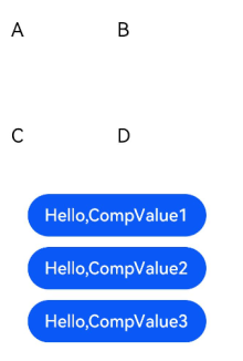
build() {
Column() {
Row() {
this.SquareText("A")
this.SquareText("B")
}
.width(2 * this.size1)
.height(1 * this.size1)
this.RowOfSquareTexts("C", "D")
Column() {
// Use the @Builder decorated custom components three times.
this.CompC(this.CompValue1)
this.CompC(this.CompValue2)
this.CompC(this.CompValue3)
}
.width(2 * this.size1)
.height(2 * this.size1)
}
.width(2 * this.size1)
.height(2 * this.size1)
}
}
```
## @BuilderParam8+
The **@BuilderParam** decorator is used to decorate the function type attributes (for example, **@BuilderParam noParam: () => void**) in a custom component. When the custom component is initialized, the attributes decorated by **@BuilderParam** must be assigned values.
### Background
In certain circumstances, you may need to add a specific function, such as a click-to-jump action, to a custom component. However, embedding an event method directly inside of the component will add the function to all places where the component is imported. This is where the **@BuilderParam** decorator comes into the picture. When initializing a custom component, you can assign a **@Builder** decorated method to the **@BuilderParam** decorated attribute, thereby adding the specific function to the custom component.
### Component Initialization Through Parameters
When initializing a custom component through parameters, assign a **@Builder** decorated method to the **@BuilderParam** decorated attribute — **content**, and call the value of **content** in the custom component. If no parameter is passed when assigning a value to the **@BuilderParam** decorated attribute (for example, **noParam: this.specificNoParam**), define the type of the attribute as a function without a return value (for example, **@BuilderParam noParam: () => void**). If any parameter is passed when assigning a value to the **@BuilderParam** decorated attribute (for example, **withParam: this.SpecificWithParam('WithParamA')**), define the type of the attribute as **any** (for example, **@BuilderParam withParam: any**).
```ts
// xxx.ets
@Component
struct CustomContainer {
header: string = ''
@BuilderParam noParam: () => void
@BuilderParam withParam: any
footer: string = ''
build() {
Column() {
Text(this.header)
.fontSize(30)
this.noParam()
this.withParam()
Text(this.footer)
.fontSize(30)
}
}
}
@Entry
@Component
struct CustomContainerUser {
@Builder specificNoParam() {
Column() {
Text('noParam').fontSize(30)
}
}
@Builder SpecificWithParam(label: string) {
Column() {
Text(label).fontSize(30)
}
}
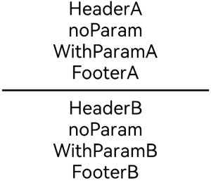
build() {
Column() {
CustomContainer({
header: 'HeaderA',
noParam: this.specificNoParam,
withParam: this.SpecificWithParam('WithParamA'),
footer: 'FooterA'
})
Divider()
.strokeWidth(3)
.margin(10)
CustomContainer({
header: 'HeaderB',
noParam: this.specificNoParam,
withParam: this.SpecificWithParam('WithParamB'),
footer: 'FooterB'
})
}
}
}
```
### Component Initialization Through Trailing Closure
In a custom component, the **@BuilderParam** decorated attribute can be initialized using a trailing closure. During initialization, the component name is followed by a pair of braces ({}) to form a trailing closure (**CustomContainer(){}**). You can consider a trailing closure as a container and add content to it. For example, you can add a component (**{Column(){...}**) to the closure. The syntax of the closure is the same as that of **build**. In this scenario, the custom component has one and only one **@BuilderParam** decorated attribute.
Example: Add a **\** component and a click event to the closure, and call the **specificParam** method decorated by **@Builder** in the new **\** component. After the **\** component is clicked, the value of the **CustomContainer** component's **header** attribute will change from **header** to **changeHeader**. When the component is initialized, the content of the trailing closure will be assigned to the **closer** attribute decorated by **@BuilderParam**.
```ts
// xxx.ets
@Component
struct CustomContainer {
header: string = ''
@BuilderParam closer: () => void
build() {
Column() {
Text(this.header)
.fontSize(30)
this.closer()
}
}
}
@Builder function specificParam(label1: string, label2: string) {
Column() {
Text(label1)
.fontSize(30)
Text(label2)
.fontSize(30)
}
}
@Entry
@Component
struct CustomContainerUser {
@State text: string = 'header'
build() {
Column() {
CustomContainer({
header: this.text,
}) {
Column() {
specificParam('testA', 'testB')
}.backgroundColor(Color.Yellow)
.onClick(() => {
this.text = 'changeHeader'
})
}
}
}
}
```

## @Styles
The **@Styles** decorator helps avoid repeated style setting, by extracting multiple style settings into one method. When declaring a component, you can invoke this method and use the **@Styles** decorator to quickly define and reuse the custom styles of a component. **@Styles** supports only universal attributes.
**@Styles** can be defined inside or outside a component declaration. When it is defined outside a component declaration, the component name must be preceded by the keyword **function**.
```ts
// xxx.ets
@Styles function globalFancy () {
.width(150)
.height(100)
.backgroundColor(Color.Pink)
}
@Entry
@Component
struct FancyUse {
@Styles componentFancy() {
.width(100)
.height(200)
.backgroundColor(Color.Yellow)
}
build() {
Column({ space: 10 }) {
Text('FancyA')
.globalFancy()
.fontSize(30)
Text('FancyB')
.globalFancy()
.fontSize(20)
Text('FancyC')
.componentFancy()
.fontSize(30)
Text('FancyD')
.componentFancy()
.fontSize(20)
}
}
}
```

**@Styles** can also be used inside the **[StateStyles](../reference/arkui-ts/ts-universal-attributes-polymorphic-style.md)** attribute declaration of a component, to assign state-specific attributes to the component.
In **StateStyles**, **@Styles** decorated methods defined outside the component can be directly called, while those defined inside can be called only with the keyword **this**.
```ts
// xxx.ets
@Styles function globalFancy () {
.width(120)
.height(120)
.backgroundColor(Color.Green)
}
@Entry
@Component
struct FancyUse {
@Styles componentFancy() {
.width(80)
.height(80)
.backgroundColor(Color.Red)
}
build() {
Row({ space: 10 }) {
Button('Fancy')
.stateStyles({
normal: {
.width(100)
.height(100)
.backgroundColor(Color.Blue)
},
disabled: this.componentFancy,
pressed: globalFancy
})
}
}
}
```

## @Extend
The **@Extend** decorator adds new attribute methods to built-in components, such as **\**, **\**, and **\