# Property Animator
You can create a property animator to animate the universal attributes of a component.
> **NOTE**
>
> This event is supported since API version 7. Updates will be marked with a superscript to indicate their earliest API version.
| API | Description |
| ------------------------------ | ------------------------------------------------------------ |
| animation(value: AnimateParam) | Applies a property animator to this component to control the transition of the component from one state to another.|
## AnimateParam
- Attributes
| Name | Type | Default Value | Description |
| ---------- | ---------------------------------------- | --------------- | ----------------------- |
| duration | number | 1000 | Animation duration, in ms. The default duration is 1000 ms. |
| curve | [Curve](ts-appendix-enums.md#curve) | Curve.Linear | Animation curve. The default curve is linear. |
| delay | number | 0 | Delay of animation playback, in ms. By default, the playback is not delayed. |
| iterations | number | 1 | Number of times that the animation is played. By default, the animation is played once. The value **-1** indicates that the animation is played for an unlimited number of times. |
| playMode | [PlayMode](ts-appendix-enums.md#playmode) | PlayMode.Normal | Animation playback mode. By default, the animation is played from the beginning after the playback is complete.|
## Example
```ts
// xxx.ets
@Entry
@Component
struct AttrAnimationExample {
@State widthSize: number = 200
@State heightSize: number = 100
@State flag: boolean = true
build() {
Column() {
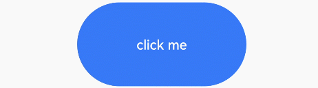
Button('click me')
.onClick((event: ClickEvent) => {
if (this.flag) {
this.widthSize = 100
this.heightSize = 50
} else {
this.widthSize = 200
this.heightSize = 100
}
this.flag = !this.flag
})
.width(this.widthSize).height(this.heightSize).backgroundColor(0x317aff)
.animation({
duration: 2000, // Animation duration
curve: Curve.EaseOut, // Animation curve
delay: 500, // Animation delay
iterations: 1, // Number of playback times
playMode: PlayMode.Normal // Animation playback mode
}) // Animation configuration for the width and height attributes of the <Button> component
}.width('100%').margin({ top: 5 })
}
}
```