# 边框设置
> **说明:**
>
> 从API Version 7开始支持。后续版本如有新增内容,则采用上角标单独标记该内容的起始版本。
>
> 从API Version 9开始,父节点的border显示在子节点内容之上。
设置组件边框样式。
## 权限列表
无
## 属性
| 名称 | 参数类型 | 默认值 | 描述 |
| ------------ | ------------- | ----------------------- | ------------------------ |
| border | BorderOptions | - | 统一边框样式设置接口。 |
| borderStyle | BorderStyle | BorderStyle.Solid | 设置元素的边框样式。 |
| borderWidth | Length | 0 | 设置元素的边框宽度。 |
| borderColor | [ResourceColor](../../ui/ts-types.md) | - | 设置元素的边框颜色。 |
| borderRadius | Length \| BorderRadiuses9+ | 0 | 设置元素的边框圆角半径。 |
- BorderOptions属性说明
| 参数名称 | 参数类型 | 默认值 | 必填 | 参数描述 |
| -------- | ------------------------------------------------------------ | ----------------- | ---- | ---------- |
| width | [Length](../../ui/ts-types.md#长度类型) \| EdgeWidth9+ | 0 | 否 | 边框宽度。 |
| color | [ResourceColor](../../ui/ts-types.md) \| EdgeColor9+ | 'Black' | 否 | 边框颜色。 |
| radius | [Length](../../ui/ts-types.md#长度类型) \| BorderRadiuses9+ | 0 | 否 | 边框角度。 |
| style | BorderStyle \| EdgeStyle9+ | BorderStyle.Solid | 否 | 边框样式。 |
- EdgeWidth9+对象说明
引入该对象时,至少传入一个参数。
| 名称 | 参数类型 | 必填 | 默认值 | 描述 |
| ------ | -------- | ---- | ------ | -------------- |
| left | length | 否 | 0 | 左侧边框宽度。 |
| right | length | 否 | 0 | 右侧边框宽度。 |
| top | length | 否 | 0 | 上侧边框宽度。 |
| bottom | length | 否 | 0 | 下侧边框宽度。 |
- EdgeColor9+对象说明
引入该对象时,至少传入一个参数。
| 名称 | 参数类型 | 必填 | 默认值 | 描述 |
| ------ | ------------------------------------- | ---- | ------- | -------------- |
| left | [ResourceColor](../../ui/ts-types.md) | 否 | 'Black' | 左侧边框颜色。 |
| right | [ResourceColor](../../ui/ts-types.md) | 否 | 'Black' | 右侧边框颜色。 |
| top | [ResourceColor](../../ui/ts-types.md) | 否 | 'Black' | 上侧边框颜色。 |
| bottom | [ResourceColor](../../ui/ts-types.md) | 否 | 'Black' | 下侧边框颜色。 |
- BorderRadiuses9+对象说明
引用该对象时,至少传入一个参数。
| 名称 | 参数类型 | 必填 | 默认值 | 描述 |
| ----------- | -------- | ---- | ------ | ---------------- |
| topLeft | length | 否 | 0 | 左上角圆角半径。 |
| topRight | length | 否 | 0 | 右上角圆角半径。 |
| bottomLeft | length | 否 | 0 | 左下角圆角半径。 |
| bottomRight | length | 否 | 0 | 右下角圆角半径。 |
- EdgeStyle9+对象说明
引入该对象时,至少传入一个参数。
| 名称 | 参数类型 | 必填 | 默认值 | 描述 |
| ------ | ----------- | ---- | ----------------- | -------------- |
| left | BorderStyle | 否 | BorderStyle.Solid | 左侧边框样式。 |
| right | BorderStyle | 否 | BorderStyle.Solid | 右侧边框样式。 |
| top | BorderStyle | 否 | BorderStyle.Solid | 上侧边框样式。 |
| bottom | BorderStyle | 否 | BorderStyle.Solid | 下侧边框样式。 |
- BorderStyle枚举说明
| 名称 | 描述 |
| ------ | ----------------------------------------------- |
| Dotted | 显示为一系列圆点,圆点半径为borderWidth的一半。 |
| Dashed | 显示为一系列短的方形虚线。 |
| Solid | 显示为一条实线。 |
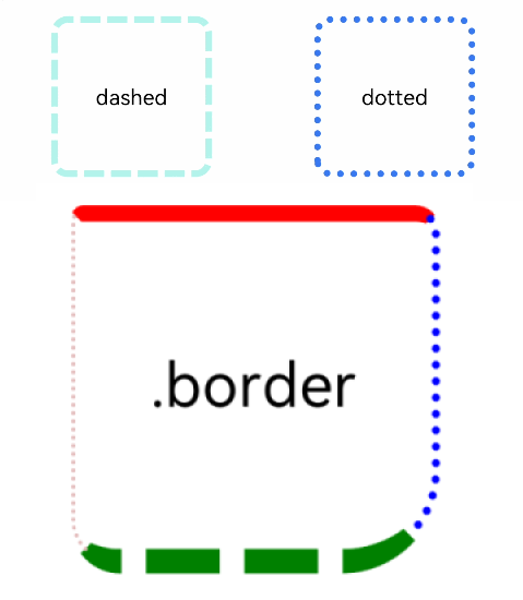
## 示例
```ts
// xxx.ets
@Entry
@Component
struct BorderExample {
build() {
Column() {
Flex({ justifyContent: FlexAlign.SpaceAround, alignItems: ItemAlign.Center }) {
// 线段
Text('dashed')
.borderStyle(BorderStyle.Dashed).borderWidth(5).borderColor(0xAFEEEE).borderRadius(10)
.width(120).height(120).textAlign(TextAlign.Center).fontSize(16)
// 点线
Text('dotted')
.border({ width: 5, color: 0x317AF7, radius: 10, style: BorderStyle.Dotted })
.width(120).height(120).textAlign(TextAlign.Center).fontSize(16)
}.width('100%').height(150)
Text('.border')
.fontSize(50)
.width(300)
.height(300)
.border({
width: { left: '5lpx', right: '10lpx', top: '20lpx', bottom: '30lpx' },
color: { left: '#e3bbbb', right: Color.Blue, top: Color.Red, bottom: Color.Green },
radius: { topLeft: 10, topRight: 20, bottomLeft: 40, bottomRight: 80 },
style: {
left: BorderStyle.Dotted,
right: BorderStyle.Dotted,
top: BorderStyle.Solid,
bottom: BorderStyle.Dashed
}
}).textAlign(TextAlign.Center)
}
}
}
```