# Text
显示一段文本的组件。
> **说明:**
> 该组件从API Version 7开始支持。后续版本如有新增内容,则采用上角标单独标记该内容的起始版本。
## 权限列表
无
## 子组件
可以包含[Span](ts-basic-components-span.md)子组件。
## 接口
Text(content?: string)
- 参数
| 参数名 | 参数类型 | 必填 | 默认值 | 参数描述 |
| -------- | -------- | -------- | -------- | -------- |
| content | string | 否 | '' | 文本内容,包含子组件Span时不生效,显示Span内容。 |
## 属性
| 名称 | 参数类型 | 默认值 | 描述 |
| -------- | -------- | -------- | -------- |
| textAlign | TextAlign | TextAlign.Start | 设置多行文本的文本对齐方式。 |
| textOverflow | {overflow: TextOverflow} | {overflow: TextOverflow.Clip} | 设置文本超长时的显示方式。
**说明:**
文本截断是按字截断。例如,英文以单词为最小单位进行截断,若需要以字母为单位进行截断,可在字母间添加零宽空格:\u200B。
需配合`maxLines`使用,单独设置不生效。 |
| maxLines | number | Infinity | 设置文本的最大行数。
**说明:**
默认情况下,文本是自动折行的,如果指定此参数,则文本最多不会超过指定的行。如果有多余的文本,可以通过 `textOverflow`来指定截断方式。 |
| lineHeight | Length | - | 设置文本的文本行高,设置值不大于0时,不限制文本行高,自适应字体大小,Length为number类型时单位为fp。 |
| decoration | {
type: TextDecorationType,
color?: Color
} | {
type: TextDecorationType.None,
color: Color.Black
} | 设置文本装饰线样式及其颜色。 |
| baselineOffset | Length | - | 设置文本基线的偏移量。 |
| textCase | TextCase | TextCase.Normal | 设置文本大小写。 |
| copyOption9+ | boolean\|CopyOption | false | 组件支持设置文本是否可复制粘贴。 |
- TextAlign枚举说明
| 名称 | 描述 |
| -------- | -------- |
| Center | 文本居中对齐。 |
| Start | 根据文字书写相同的方向对齐。 |
| End | 根据文字书写相反的方向对齐。 |
- TextOverflow枚举说明
| 名称 | 描述 |
| -------- | -------- |
| Clip | 文本超长时进行裁剪显示。 |
| Ellipsis | 文本超长时显示不下的文本用省略号代替。 |
| None | 文本超长时不进行裁剪。 |
- TextDecorationType枚举说明
| 名称 | 描述 |
| -------- | -------- |
| Underline | 文字下划线修饰。 |
| LineThrough | 穿过文本的修饰线。 |
| Overline | 文字上划线修饰。 |
| None | 不使用文本装饰线。 |
- TextCase枚举说明
| 名称 | 描述 |
| --------- | -------------------- |
| Normal | 保持文本原有大小写。 |
| LowerCase | 文本采用全小写。 |
| UpperCase | 文本采用全大写。 |
- CopyOption9+枚举说明
| 名称 | 描述 |
| -------- | -------- |
| InApp | 支持应用内复制粘贴。 |
| LocalDevice | 支持设备内复制粘贴。 |
| CrossDevice | 支持跨设备复制粘贴。 |
> **说明:**
> 不支持Text内同时存在文本内容和Span子组件。如果同时存在,只显示Span内的内容。
## 示例
```ts
// xxx.ets
@Entry
@Component
struct TextExample1 {
build() {
Flex({ direction: FlexDirection.Column, alignItems: ItemAlign.Start, justifyContent: FlexAlign.SpaceBetween }) {
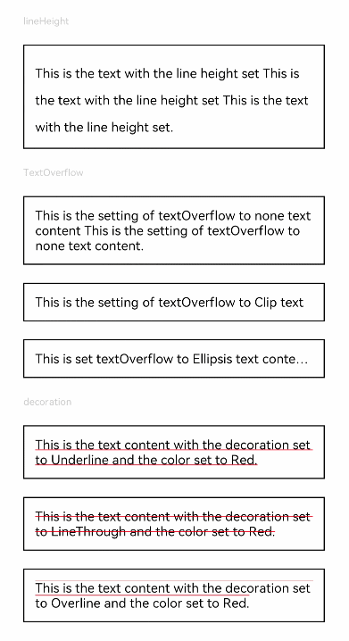
Text('lineHeight').fontSize(9).fontColor(0xCCCCCC)
Text('This is the text with the line height set This is the text with the line height set This is the text with the line height set.')
.lineHeight(25).fontSize(12).border({ width: 1 }).padding(10)
Text('TextOverflow').fontSize(9).fontColor(0xCCCCCC)
Text('This is the setting of textOverflow to none text content This is the setting of textOverflow to none text content.')
.textOverflow({ overflow: TextOverflow.None })
.fontSize(12).border({ width: 1 }).padding(10)
Text('This is the setting of textOverflow to Clip text content This is the setting of textOverflow to Clip text content.')
.textOverflow({ overflow: TextOverflow.Clip })
.maxLines(1).fontSize(12).border({ width: 1 }).padding(10)
Text('This is set textOverflow to Ellipsis text content This is set textOverflow to Ellipsis text content.'.split('').join('\u200B'))
.textOverflow({ overflow: TextOverflow.Ellipsis })
.maxLines(1).fontSize(12).border({ width: 1 }).padding(10)
Text('decoration').fontSize(9).fontColor(0xCCCCCC)
Text('This is the text content with the decoration set to Underline and the color set to Red.')
.decoration({ type: TextDecorationType.Underline, color: Color.Red })
.fontSize(12).border({ width: 1 }).padding(10)
Text('This is the text content with the decoration set to LineThrough and the color set to Red.')
.decoration({ type: TextDecorationType.LineThrough, color: Color.Red })
.fontSize(12).border({ width: 1 }).padding(10)
Text('This is the text content with the decoration set to Overline and the color set to Red.')
.decoration({ type: TextDecorationType.Overline, color: Color.Red })
.fontSize(12).border({ width: 1 }).padding(10)
}.height(600).width(350).padding({ left: 35, right: 35, top: 35 })
}
}
```
```ts
// xxx.ets
@Entry
@Component
struct TextExample2 {
build() {
Flex({ direction: FlexDirection.Column, alignItems: ItemAlign.Start, justifyContent: FlexAlign.SpaceBetween }) {
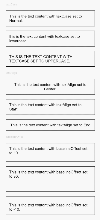
Text('textCase').fontSize(9).fontColor(0xCCCCCC)
Text('This is the text content with textCase set to Normal.')
.textCase(TextCase.Normal)
.fontSize(12).border({ width: 1 }).padding(10).width('100%')
Text('This is the text content with textCase set to LowerCase.')
.textCase(TextCase.LowerCase)
.fontSize(12).border({ width: 1 }).padding(10).width('100%')
Text('This is the text content with textCase set to UpperCase.')
.textCase(TextCase.UpperCase)
.fontSize(12).border({ width: 1 }).padding(10)
Text('textAlign').fontSize(9).fontColor(0xCCCCCC)
Text('This is the text content with textAlign set to Center.')
.textAlign(TextAlign.Center)
.fontSize(12).border({ width: 1 }).padding(10).width('100%')
Text('This is the text content with textAlign set to Start.')
.textAlign(TextAlign.Start)
.fontSize(12).border({ width: 1 }).padding(10).width('100%')
Text('This is the text content with textAlign set to End.')
.textAlign(TextAlign.End)
.fontSize(12).border({ width: 1 }).padding(10).width('100%')
Text('baselineOffset').fontSize(9).fontColor(0xCCCCCC)
Text('This is the text content with baselineOffset set to 10.')
.baselineOffset(10).fontSize(12).border({ width: 1 }).padding(10).width('100%')
Text('This is the text content with baselineOffset set to 30.')
.baselineOffset(30).fontSize(12).border({ width: 1 }).padding(10).width('100%')
Text('This is the text content with baselineOffset set to -10.')
.baselineOffset(-10).fontSize(12).border({ width: 1 }).padding(10).width('100%')
}.height(700).width(350).padding({ left: 35, right: 35, top: 35 })
}
}
```