# Button
The **** component can be used to set a capsule, circle, text, arc, or download button. For details, see [button](../js-reference/js-based-web-like-development-paradigm/js-components-basic-button.md).
## Creating a Component
Create a **** component in the **.hml** file under **pages/index**.
```
```
```
/* xxx.css */
.container {
flex-direction: column;
justify-content: center;
align-items: center;
background-color: #F1F3F5;
}
```
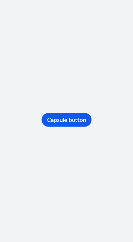
## Setting the Button Type
Set the **type** attribute of the **** component to **button**, **date**, or any of the supported values.
```
```
```
/* xxx.css */
.container {
background-color: #F1F3F5;
flex-direction: column;
align-items: center;
justify-content: center;
}
.circle {
font-size: 120px;
background-color: blue;
radius: 72px;
}
.text {
margin-top: 30px;
text-color: white;
font-size: 30px;
font-style: normal;
background-color: blue;
width: 50%;
height: 100px;
}
```
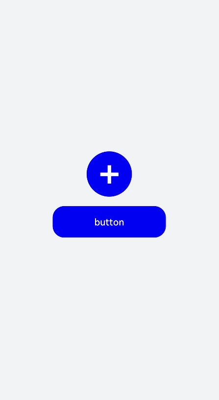
> **NOTE:**
>- For capsule buttons, border-related styles are not supported.
>- For circle buttons, text-related styles are not supported.
>- For text buttons, the text size is adaptive, and **radius**, **width**, and **height** cannot be set. The **background-color** style is not supported when the background is completely transparent.
>- If the icon used by the **** component is from the cloud, you must declare the **ohos.permission.INTERNET** permission in the **config.json** file under the **resources** folder.
Sample code for declaring the **ohos.permission.INTERNET** permission in the **config.json** file under the **resources** folder:
```
"module": {
"reqPermissions": [{
"name": "ohos.permission.INTERNET"
}],
}
```
## Showing the Download Progress
Add the **progress** method to the **** component to display the download progress in real time.
```