# <button> Development
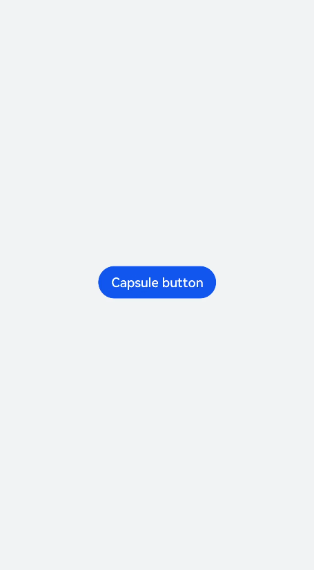
The<button>component can be used to set a capsule, circle, text, arc, or download button. For details, see [button](../reference/arkui-js/js-components-basic-button.md).
## Creating a <button> Component
Create a <button> component in the .hml file under pages/index.
```
```
```
/* xxx.css */
.container {
flex-direction: column;
justify-content: center;
align-items: center;
background-color: #F1F3F5;
}
```

## Setting the Button Type
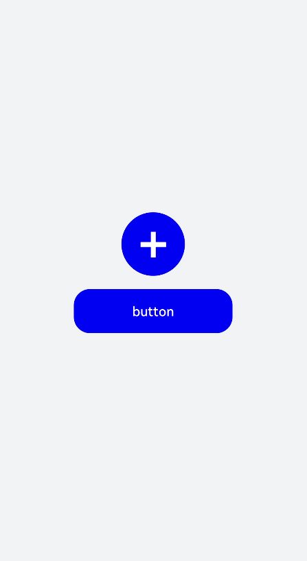
Set the type attribute of the <input> component to button, date, or any of the supported values.
```
```
```
/* xxx.css */
.container {
background-color: #F1F3F5;
flex-direction: column;
align-items: center;
justify-content: center;
}
.circle {
font-size: 120px;
background-color: blue;
radius: 72px;
}
.text {
margin-top: 30px;
text-color: white;
font-size: 30px;
font-style: normal;
background-color: blue;
width: 50%;
height: 100px;
}
```

>  **NOTE**:
> - For capsule buttons, border-related styles are not supported.
>
> - For circle buttons, text-related styles are not supported.
>
> - For text buttons, the text size is adaptive, and radius, width, and height cannot be set. The background-color style is not supported when the background is completely transparent.
>
> - If the icon used by the<button>component is from the cloud, you must declare the ohos.permission.INTERNET permission in the config.json file under the resources folder.
Sample code for declaring the ohos.permission.INTERNET permission in the config.json file under the resources folder:
```
"module": {
"reqPermissions": [{
"name": "ohos.permission.INTERNET"
}],
}
```
## Showing the Download Progress
Add the progress method to the<button>component to display the download progress in real time.
```