# Panel
> **NOTE**
> This component is supported since API version 7. Updates will be marked with a superscript to indicate their earliest API version.
The **** component is a slidable panel that presents lightweight content with flexible sizes. It is a pop-up component.
## Required Permissions
None
## Child Components
This component can contain child components.
## APIs
Panel(value:{show:boolean})
- Parameters
| Name | Type | Mandatory | Default Value | Description |
| -------- | -------- | -------- | -------- | -------- |
| show | boolean | Yes | - | Whether to show or hide the panel. |
## Attributes
| Name | Type | Default Value | Description |
| -------- | -------- | -------- | -------- |
| type | PanelType | PanelType.Foldable | Type of the panel. |
| mode | PanelMode | - | Initial status of the panel. |
| dragBar | boolean | true | Whether to enable a drag bar. The value **true** means to display the drag bar, and **false** means the opposite. |
| fullHeight | Length | - | Panel height in the **PanelMode.Full** mode. |
| halfHeight | Length | - | Panel height in the **PanelMode.Half** mode. The default value is half of the screen height. |
| miniHeight | Length | - | Panel height in the **PanelMode.Mini** mode. |
- PanelType enums
| Name | Description |
| -------- | -------- |
| Minibar | A minibar panel that displays content in the minibar area or a large (fullscreen-like) area. |
| Foldable | A foldable panel that displays permanent content in a large (fullscreen-like), medium-sized (halfscreen-like), or small area. |
| Temporary | A temporary panel that displays content in a large (fullscreen-like) or medium-sized (halfscreen-like) area. |
- PanelMode enums
| Name | Description |
| -------- | -------- |
| Mini | Display of a minibar or foldable panel in its minimum size. This attribute does not take effect for **temporary** panels. |
| Half | Display of a foldable or temporary panel in a medium-sized (halfscreen-like) area. This attribute does not take effect for **minibar** panels. |
| Full | Display of a panel in a large (fullscreen-like) area. |
## Events
| Name | Description |
| -------- | -------- |
| onChange(callback: (width: number, height: number, mode: PanelMode) => void) | Triggered when the panel status changes. The returned height value is the height of the content area. When the value of **dragbar** is **true**, the height of the panel is the drag bar height plus the height of the content area. |
## Example
```
@Entry
@Component
struct PanelExample {
@State show: boolean = false
build() {
Column() {
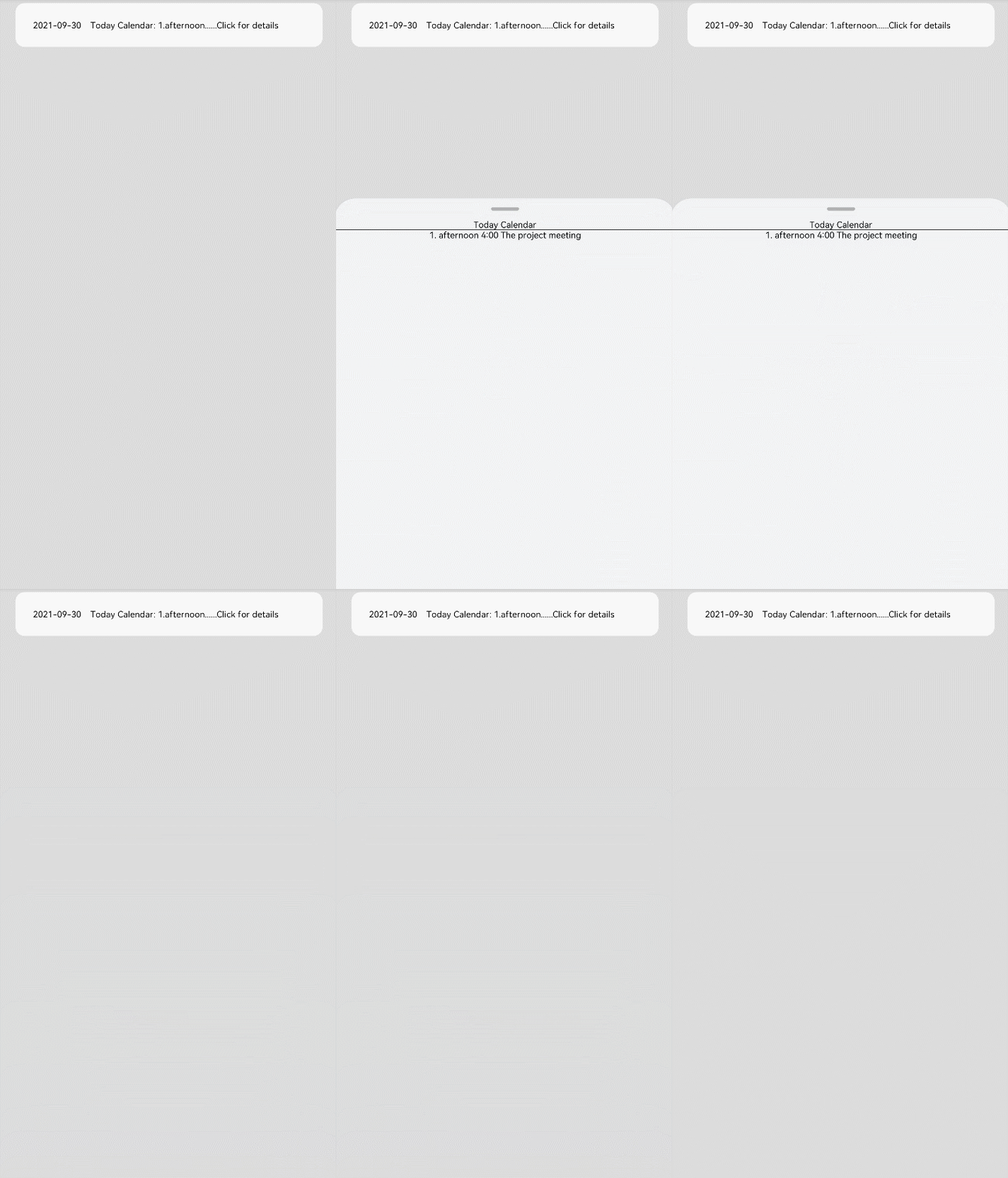
Text('2021-09-30 Today Calendar: 1.afternoon......Click for details')
.width('90%').height(50).borderRadius(10)
.backgroundColor(0xFFFFFF).padding({ left: 20 })
.onClick(() => {
this.show = !this.show
})
Panel(this.show) { // Display the agenda.
Column() {
Text('Today Calendar')
Divider()
Text('1. afternoon 4:00 The project meeting')
}
}
.type(PanelType.Foldable).mode(PanelMode.Half)
.dragBar(true) // The drag bar is enabled by default.
.halfHeight(500) // The default value is half of the screen height.
.onChange((width: number, height: number, mode: PanelMode) => {
console.info(`width:${width},height:${height},mode:${mode}`)
})
}.width('100%').height('100%').backgroundColor(0xDCDCDC).padding({ top: 5 })
}
}
```
