# Rating
> **NOTE**
> This component is supported since API version 7. Updates will be marked with a superscript to indicate their earliest API version.
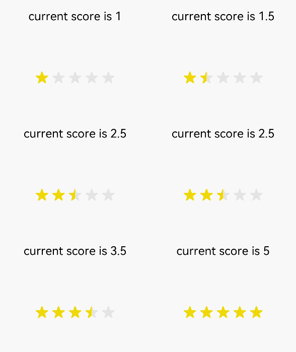
The **<Rating>** component provides a rating bar.
## Required Permissions
None
## Child Components
None
## APIs
Rating(options?: { rating: number, indicator?: boolean })
- Parameters
| Name | Type | Mandatory | Default Value | Description |
| -------- | -------- | -------- | -------- | -------- |
| rating | number | Yes | 0 | Value to rate. |
| indicator | boolean | No | false | Used only as an indicator and cannot be operated. |
## Attributes
| Name | Type | Default Value | Description |
| -------- | -------- | -------- | -------- |
| stars | number | 5 | Total number of stars. |
| stepSize | number | 0.5 | Step of an operation. |
| starStyle | {
backgroundUri: string,
foregroundUri: string,
secondaryUri?: string
} | - | **backgroundSrc**: image link of the unselected star. You can customize the image or use the default image. Only local images are supported.
**foregroundSrc**: image path of the selected star. You can customize the image or use the default image. Only local images are supported.
**secondarySrc**: image path of the partially selected star. You can customize the image or use the default image. Only local images are supported. |
## Events
| Name | Description |
| -------- | -------- |
| onChange(callback:(value: number) => void) | Triggered when the rating value changes. |
## Example
```
@Entry
@Component
struct RatingExample {
@State rating: number = 1
@State indicator: boolean = false
build() {
Flex({ direction: FlexDirection.Column, alignItems: ItemAlign.Center, justifyContent: FlexAlign.SpaceBetween }) {
Text('current score is ' + this.rating).fontSize(20)
Rating({ rating: this.rating, indicator: this.indicator })
.stars(5)
.stepSize(0.5)
.onChange((value: number) => {
this.rating = value
})
}.width(350).height(200).padding(35)
}
}
```
