# 核心
## 目 录
1. [Gradle 依赖](#gradle-dependency)
2. [基础知识](#basics)
3. [自定义消息](#customizing-the-message)
4. [动作按钮](#action-buttons)
5. [添加图标](#adding-an-icon)
6. [回调](#callbacks)
7. [Dismissing](#dismissing)
8. [列表](#lists)1。[平原](#plain)2。[单一选择](#single-choice)3。[多项选择](#multiple-choice)4。[Custom Adapters](#custom-adapters)
9. [复选框提示](#checkbox-prompts)
10. [自定义视图](#custom-views)
11. [杂项](#miscellaneous)
12. [主题化](#theming)1。[光明与黑暗](#light-and-dark)2。[背景颜色](#background-color)3。[波纹颜色](#ripple-color)4。[转角半径](#corner-radius)5。[文字颜色](#text-color)6。[字体](#fonts)7。[Widget Color](#widget-color)
## Gradle 依赖
[  ](https://repo1.maven.org/maven2/com/afollestad/material-dialogs/core)
`core` 模块包含了启动库所需的所有内容。它包含所有核心和正常使用的功能。
```gradle
dependencies {
...
implementation 'com.afollestad.material-dialogs:core:3.2.1'
}
```
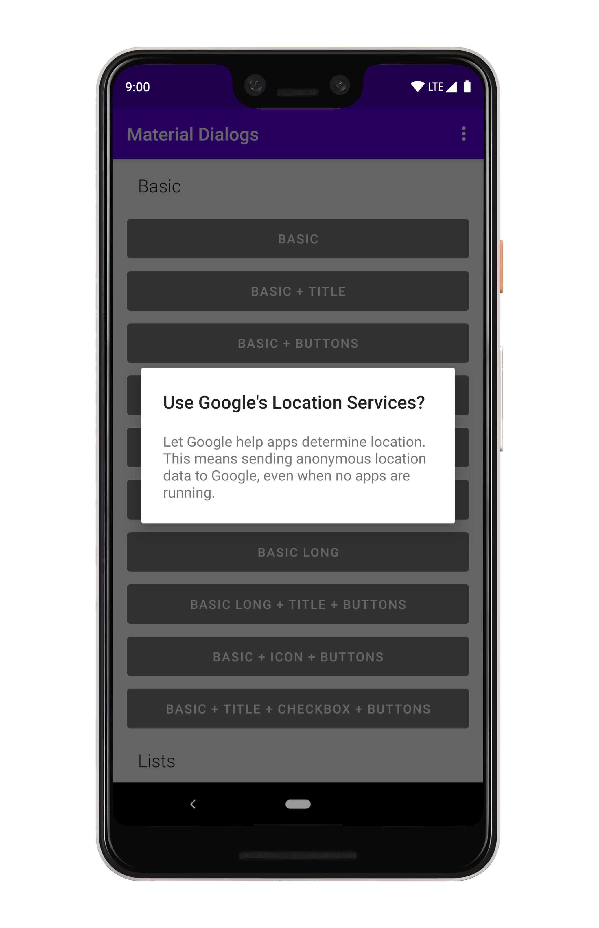
## Basics
下面是一个创建和显示对话框的基本示例:
 ```kotlin
MaterialDialog(this).show {
title(R.string.your_title)
message(R.string.your_message)
}
```
`this` 应该是一个 `Context`,它连接到一个窗口,就像 `Activity`。
如果你想要传入文字字符串而不是字符串资源:
```kotlin
MaterialDialog(this).show {
title(text = "Your Title")
message(text = "Your Message")
}
```
请注意,你也可以在不立即显示对话框的情况下设置对话框:
```kotlin
val dialog = MaterialDialog(this)
.title(R.string.your_title)
.message(R.string.your_message)
dialog.show()
```
## 自定义消息
`message`函数允许你使用 lambda 跟踪它,该 lambda 公开了某些内置的修饰符,并允许你直接对 `TextView` 进行操作。
```kotlin
MaterialDialog(this).show {
...
message(R.string.your_message) {
html() // format, color, etc. with tags in string
html { link -> // same as above, but...
// Invokes a callback when a URL is clicked instead of auto opening it in a browser
}
lineSpacing(1.4f) // modifies line spacing, default is 1.0f
// You can directly act on the message TextView as well
val textView = messageTextView
}
}
```
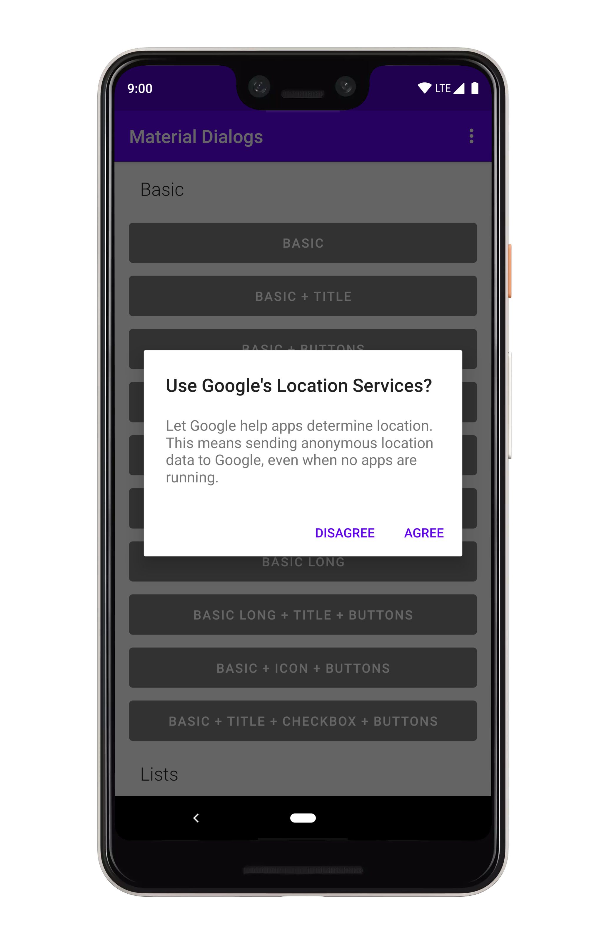
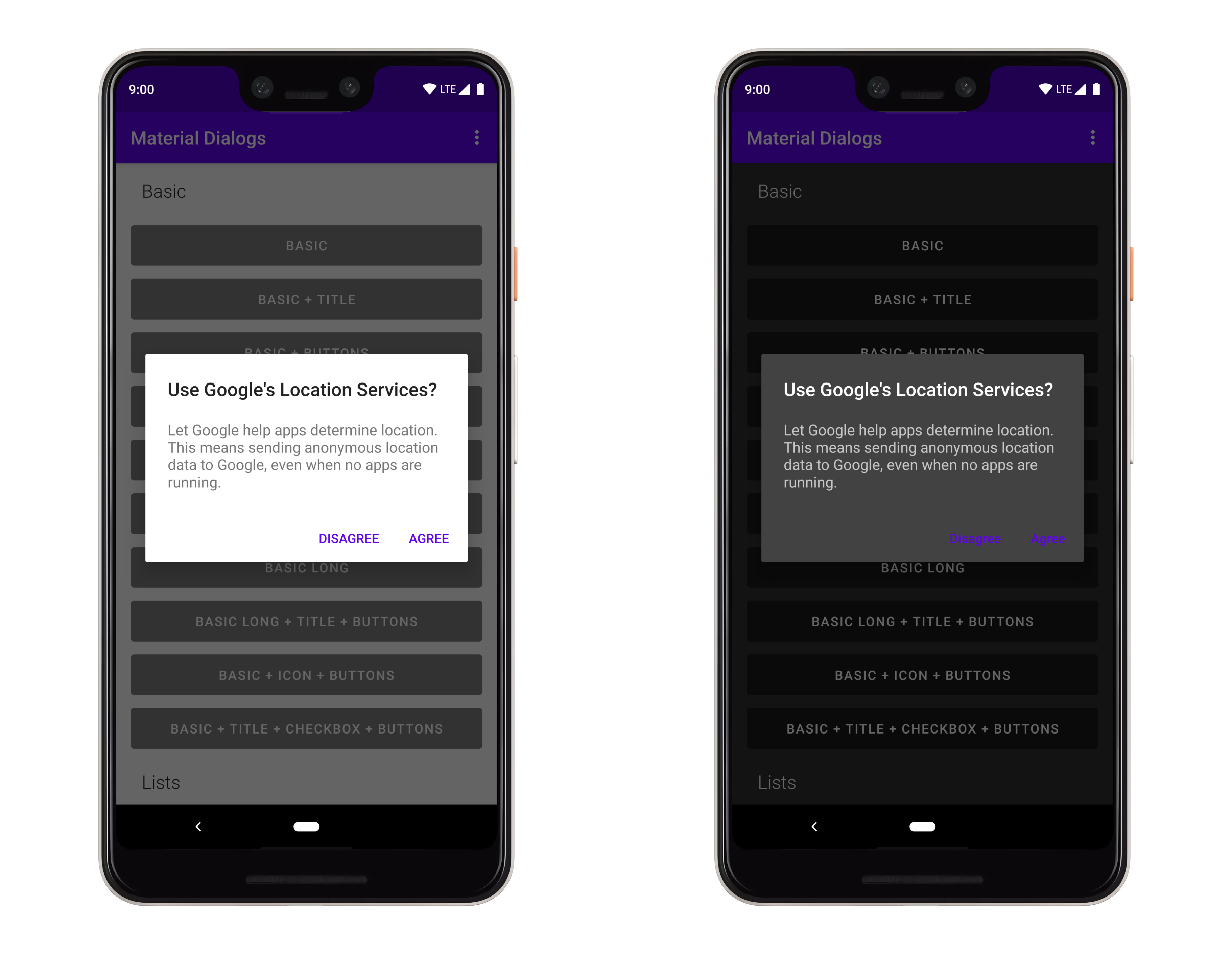
## Action Buttons
添加动作按钮的方法很简单:
```kotlin
MaterialDialog(this).show {
title(R.string.your_title)
message(R.string.your_message)
}
```
`this` 应该是一个 `Context`,它连接到一个窗口,就像 `Activity`。
如果你想要传入文字字符串而不是字符串资源:
```kotlin
MaterialDialog(this).show {
title(text = "Your Title")
message(text = "Your Message")
}
```
请注意,你也可以在不立即显示对话框的情况下设置对话框:
```kotlin
val dialog = MaterialDialog(this)
.title(R.string.your_title)
.message(R.string.your_message)
dialog.show()
```
## 自定义消息
`message`函数允许你使用 lambda 跟踪它,该 lambda 公开了某些内置的修饰符,并允许你直接对 `TextView` 进行操作。
```kotlin
MaterialDialog(this).show {
...
message(R.string.your_message) {
html() // format, color, etc. with tags in string
html { link -> // same as above, but...
// Invokes a callback when a URL is clicked instead of auto opening it in a browser
}
lineSpacing(1.4f) // modifies line spacing, default is 1.0f
// You can directly act on the message TextView as well
val textView = messageTextView
}
}
```
## Action Buttons
添加动作按钮的方法很简单:
 ```kotlin
MaterialDialog(this).show {
positiveButton(R.string.agree)
negativeButton(R.string.disagree)
}
```
你也可以在这里使用文字字符串:
```kotlin
MaterialDialog(this).show {
positiveButton(text = "Agree")
negativeButton(text = "Disagree")
}
```
---
监听按钮的点击就像在末尾添加一个 lambda 一样简单:
```kotlin
MaterialDialog(this).show {
positiveButton(R.string.agree) { dialog ->
// Do something
}
negativeButton(R.string.disagree) { dialog ->
// Do something
}
}
```
如果动作按钮太长,不能与对话框的宽度相适应,它们将自动堆叠:
```kotlin
MaterialDialog(this).show {
positiveButton(R.string.agree)
negativeButton(R.string.disagree)
}
```
你也可以在这里使用文字字符串:
```kotlin
MaterialDialog(this).show {
positiveButton(text = "Agree")
negativeButton(text = "Disagree")
}
```
---
监听按钮的点击就像在末尾添加一个 lambda 一样简单:
```kotlin
MaterialDialog(this).show {
positiveButton(R.string.agree) { dialog ->
// Do something
}
negativeButton(R.string.disagree) { dialog ->
// Do something
}
}
```
如果动作按钮太长,不能与对话框的宽度相适应,它们将自动堆叠:
 ## Adding an Icon
你可以在标题的左侧显示一个图标:
## Adding an Icon
你可以在标题的左侧显示一个图标:
 ```kotlin
MaterialDialog(this).show {
icon(R.drawable.your_icon)
}
```
你还可以传递一个可拉伸实例:
```kotlin
val myDrawable: Drawable = // ...
MaterialDialog(this).show {
icon(drawable = myDrawable)
}
```
## Callbacks
有几个生命周期回调可以连接到:
```kotlin
MaterialDialog(this).show {
onPreShow { dialog -> }
onShow { dialog -> }
onDismiss { dialog -> }
onCancel { dialog -> }
}
```
## 解雇
取消对话框会关闭它,它只是从父类 `Dialog` 类继承的一个简单方法:
```kotlin
val dialog: MaterialDialog = // ...
dialog.dismiss()
```
---
你可以防止对话框被取消,这意味着必须通过操作按钮或调用上面的方法来明确地取消对话框。
```kotlin
MaterialDialog(this).show {
cancelable(false) // calls setCancelable on the underlying dialog
cancelOnTouchOutside(false) // calls setCanceledOnTouchOutside on the underlying dialog
}
```
## Lists
### Plain
你可以在 `MaterialDialog` 上使用 `listItems` 扩展来显示列表:
```kotlin
MaterialDialog(this).show {
icon(R.drawable.your_icon)
}
```
你还可以传递一个可拉伸实例:
```kotlin
val myDrawable: Drawable = // ...
MaterialDialog(this).show {
icon(drawable = myDrawable)
}
```
## Callbacks
有几个生命周期回调可以连接到:
```kotlin
MaterialDialog(this).show {
onPreShow { dialog -> }
onShow { dialog -> }
onDismiss { dialog -> }
onCancel { dialog -> }
}
```
## 解雇
取消对话框会关闭它,它只是从父类 `Dialog` 类继承的一个简单方法:
```kotlin
val dialog: MaterialDialog = // ...
dialog.dismiss()
```
---
你可以防止对话框被取消,这意味着必须通过操作按钮或调用上面的方法来明确地取消对话框。
```kotlin
MaterialDialog(this).show {
cancelable(false) // calls setCancelable on the underlying dialog
cancelOnTouchOutside(false) // calls setCanceledOnTouchOutside on the underlying dialog
}
```
## Lists
### Plain
你可以在 `MaterialDialog` 上使用 `listItems` 扩展来显示列表:
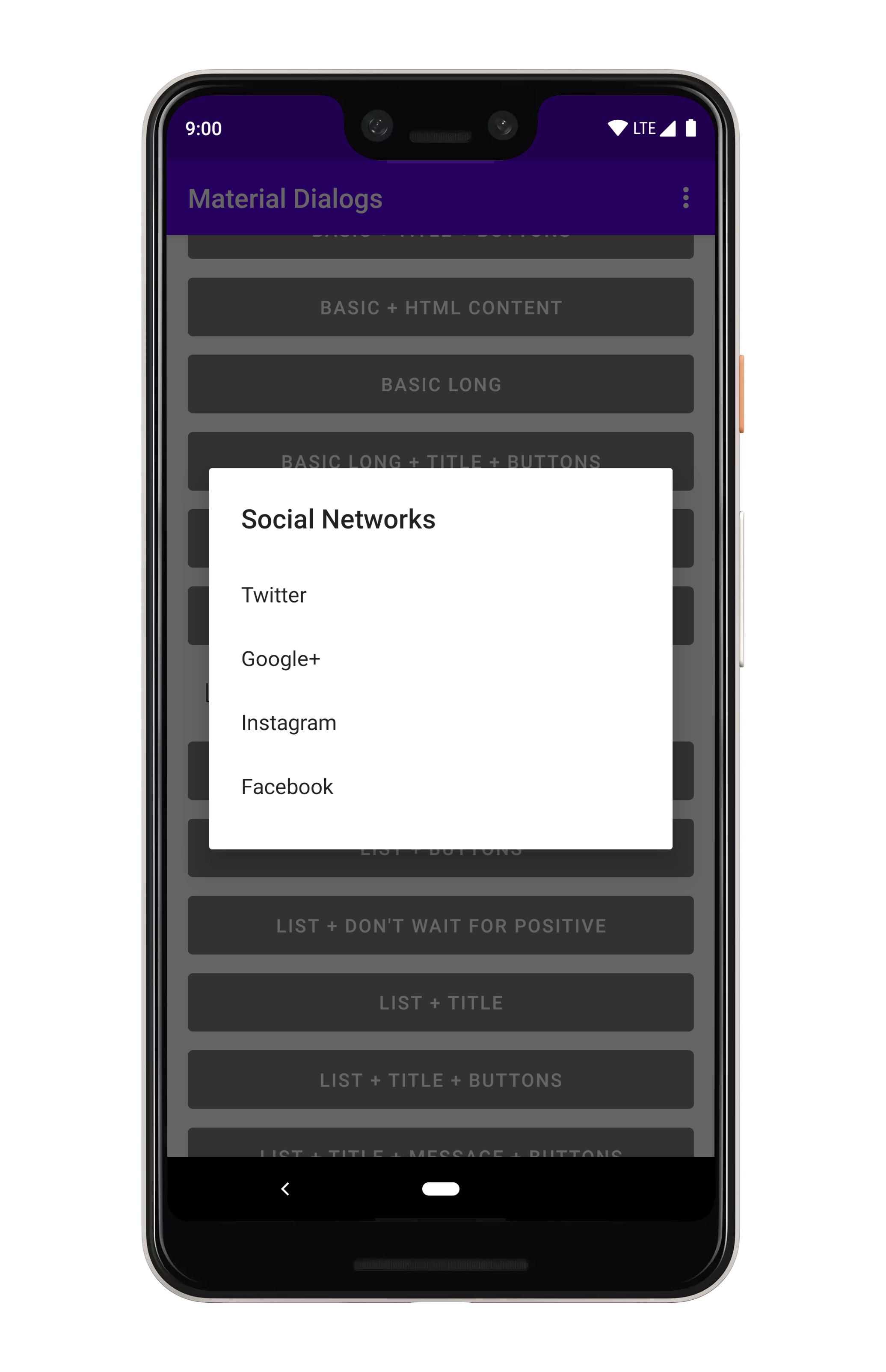 ```kotlin
MaterialDialog(this).show {
listItems(R.array.socialNetworks)
}
```
你也可以传递一个文字字符串数组:
```kotlin
val myItems = listOf("Hello", "World")
MaterialDialog(this).show {
listItems(items = myItems)
}
```
要获得项目选择事件,只需追加一个 lambda:
```kotlin
MaterialDialog(this).show {
listItems(R.array.socialNetworks) { dialog, index, text ->
// Invoked when the user taps an item
}
}
```
### Single Choice
你可以在 `MaterialDialog` 上使用 `listItemsSingleChoice` 扩展来显示单选(单选按钮)列表:
```kotlin
MaterialDialog(this).show {
listItems(R.array.socialNetworks)
}
```
你也可以传递一个文字字符串数组:
```kotlin
val myItems = listOf("Hello", "World")
MaterialDialog(this).show {
listItems(items = myItems)
}
```
要获得项目选择事件,只需追加一个 lambda:
```kotlin
MaterialDialog(this).show {
listItems(R.array.socialNetworks) { dialog, index, text ->
// Invoked when the user taps an item
}
}
```
### Single Choice
你可以在 `MaterialDialog` 上使用 `listItemsSingleChoice` 扩展来显示单选(单选按钮)列表:
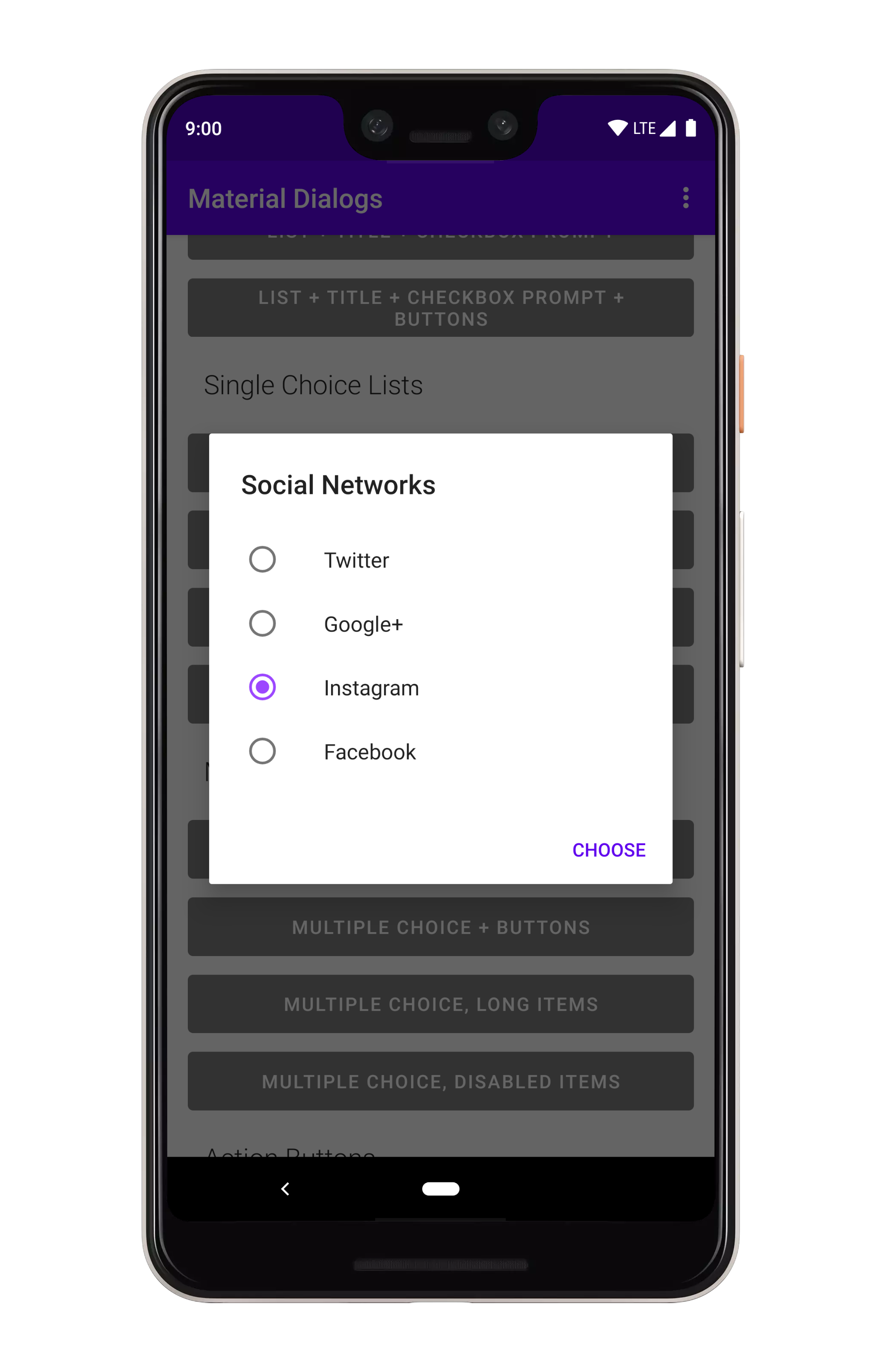 ```kotlin
MaterialDialog(this).show {
listItemsSingleChoice(R.array.my_items)
}
```
你也可以传递一个文字字符串数组:
```kotlin
val myItems = listOf("Hello", "World")
MaterialDialog(this).show {
listItemsSingleChoice(items = myItems)
}
```
---
如果希望在对话框打开时选择一个选项,可以传递 `initialSelection` 索引):
```kotlin
MaterialDialog(this).show {
listItemsSingleChoice(R.array.my_items, initialSelection = 1)
}
```
要获得项目选择事件,只需追加一个 lambda:
```kotlin
MaterialDialog(this).show {
listItemsSingleChoice(R.array.my_items) { dialog, index, text ->
// Invoked when the user selects an item
}
}
```
在没有操作按钮的情况下,当用户点击一个项目时,会立即调用选择回调。如果你添加一个积极的行动按钮...
```kotlin
MaterialDialog(this).show {
listItemsSingleChoice(R.array.my_items) { dialog, index, text ->
// Invoked when the user selects an item
}
positiveButton(R.string.select)
}
```
...然后,直到用户选择一个项目并点击“积极行动”按钮,才会调用回调。你可以使用 `waitForPositiveButton` 参数覆盖该行为。
额外的好处是,你可以禁用被选中 / 未选中的项目:
```kotlin
val indices = intArrayOf(0, 2)
MaterialDialog(this).show {
listItemsSingleChoice(R.array.my_items, disabledIndices = indices)
}
```
---
在构建的对话框中,你可以使用一些方法来修改选中的状态:
```kotlin
val dialog: MaterialDialog = // ...
dialog.checkItem(index)
dialog.uncheckItem(index)
dialog.toggleItemChecked(index)
val checked: Boolean = dialog.isItemChecked(index)
```
### Multiple Choice
你可以在 `MaterialDialog` 上使用 `listItemsMultiChoice` 扩展来显示多项选择(复选框)列表:
```kotlin
MaterialDialog(this).show {
listItemsSingleChoice(R.array.my_items)
}
```
你也可以传递一个文字字符串数组:
```kotlin
val myItems = listOf("Hello", "World")
MaterialDialog(this).show {
listItemsSingleChoice(items = myItems)
}
```
---
如果希望在对话框打开时选择一个选项,可以传递 `initialSelection` 索引):
```kotlin
MaterialDialog(this).show {
listItemsSingleChoice(R.array.my_items, initialSelection = 1)
}
```
要获得项目选择事件,只需追加一个 lambda:
```kotlin
MaterialDialog(this).show {
listItemsSingleChoice(R.array.my_items) { dialog, index, text ->
// Invoked when the user selects an item
}
}
```
在没有操作按钮的情况下,当用户点击一个项目时,会立即调用选择回调。如果你添加一个积极的行动按钮...
```kotlin
MaterialDialog(this).show {
listItemsSingleChoice(R.array.my_items) { dialog, index, text ->
// Invoked when the user selects an item
}
positiveButton(R.string.select)
}
```
...然后,直到用户选择一个项目并点击“积极行动”按钮,才会调用回调。你可以使用 `waitForPositiveButton` 参数覆盖该行为。
额外的好处是,你可以禁用被选中 / 未选中的项目:
```kotlin
val indices = intArrayOf(0, 2)
MaterialDialog(this).show {
listItemsSingleChoice(R.array.my_items, disabledIndices = indices)
}
```
---
在构建的对话框中,你可以使用一些方法来修改选中的状态:
```kotlin
val dialog: MaterialDialog = // ...
dialog.checkItem(index)
dialog.uncheckItem(index)
dialog.toggleItemChecked(index)
val checked: Boolean = dialog.isItemChecked(index)
```
### Multiple Choice
你可以在 `MaterialDialog` 上使用 `listItemsMultiChoice` 扩展来显示多项选择(复选框)列表:
 ```kotlin
MaterialDialog(this).show {
listItemsMultiChoice(R.array.my_items) { _, index, text ->
// Invoked when the user selects item(s)
}
}
```
你也可以传递一个文字字符串数组:
```kotlin
val myItems = listOf("Hello", "World")
MaterialDialog(this).show {
listItemsMultiChoice(items = myItems)
}
```
---
如果希望在对话框打开时选择选项,可以传递 `initialSelection` 索引):
```kotlin
val indices = intArrayOf(1, 3)
MaterialDialog(this).show {
listItemsMultiChoice(R.array.my_items, initialSelection = indices)
}
```
要获得项目选择事件,只需追加一个 lambda:
```kotlin
MaterialDialog(this).show {
listItemsMultiChoice(R.array.my_items) { dialog, indices, items ->
// Invoked when the user selects an item
}
}
```
在没有操作按钮的情况下,当用户点击一个项目时,会立即调用选择回调。如果你添加一个积极的行动按钮...
```kotlin
MaterialDialog(this).show {
listItemsMultiChoice(R.array.my_items) { dialog, indices, items ->
// Invoked when the user selects an item
}
positiveButton(R.string.select)
}
```
...然后,直到用户选择一个或多个项目并点击“积极行动”按钮,才会调用回调。你可以使用 `waitForPositiveButton` 参数覆盖该行为。
额外的好处是,你可以禁用被选中 / 未选中的项目:
```kotlin
val indices = intArrayOf(0, 2)
MaterialDialog(this).show {
listItemsMultiChoice(R.array.my_items, disabledIndices = indices)
}
```
---
在构建的对话框中,你可以使用一些方法来修改选中的状态:
```kotlin
val dialog: MaterialDialog = // ...
val indices: IntArray = // ...
dialog.checkItems(indices)
dialog.uncheckItems(indices)
dialog.toggleItemsChecked(indices)
dialog.checkAllItems()
dialog.uncheckAllItems()
dialog.toggleAllItemsChecked()
val checked: Boolean = dialog.isItemChecked(index)
```
### 自定义适配器
如果希望自定义列表以使用自己的视图,则需要使用自定义适配器。
```kotlin
val adapter: RecyclerView.Adapter<*> = // some sort of adapter implementation...
MaterialDialog(this).show {
customListAdapter(adapter)
}
```
稍后可以从对话框实例中再次检索适配器:
```kotlin
val dialog: MaterialDialog = // ...
val adapter: RecyclerView.Adapter<*> = dialog.getListAdapter()
```
你还可以检索适配器托管在以下位置的 `RecyclerView`:
```kotlin
val dialog: MaterialDialog = // ...
val recyclerView: RecyclerView = dialog.getRecyclerView()
```
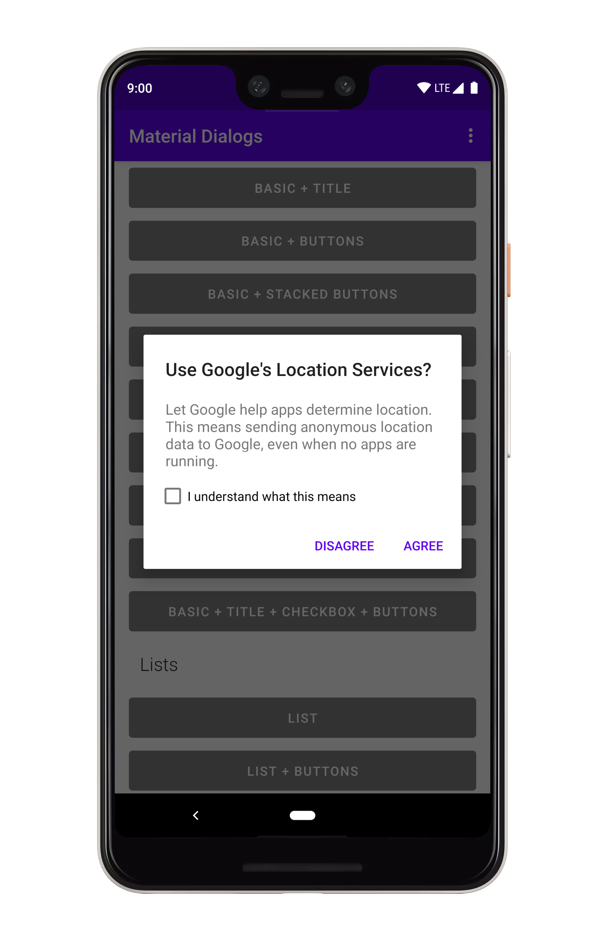
## 复选框提示
复选框提示可以与任何其他对话框类型一起使用,它将在显示操作按钮的同一视图中显示。
```kotlin
MaterialDialog(this).show {
listItemsMultiChoice(R.array.my_items) { _, index, text ->
// Invoked when the user selects item(s)
}
}
```
你也可以传递一个文字字符串数组:
```kotlin
val myItems = listOf("Hello", "World")
MaterialDialog(this).show {
listItemsMultiChoice(items = myItems)
}
```
---
如果希望在对话框打开时选择选项,可以传递 `initialSelection` 索引):
```kotlin
val indices = intArrayOf(1, 3)
MaterialDialog(this).show {
listItemsMultiChoice(R.array.my_items, initialSelection = indices)
}
```
要获得项目选择事件,只需追加一个 lambda:
```kotlin
MaterialDialog(this).show {
listItemsMultiChoice(R.array.my_items) { dialog, indices, items ->
// Invoked when the user selects an item
}
}
```
在没有操作按钮的情况下,当用户点击一个项目时,会立即调用选择回调。如果你添加一个积极的行动按钮...
```kotlin
MaterialDialog(this).show {
listItemsMultiChoice(R.array.my_items) { dialog, indices, items ->
// Invoked when the user selects an item
}
positiveButton(R.string.select)
}
```
...然后,直到用户选择一个或多个项目并点击“积极行动”按钮,才会调用回调。你可以使用 `waitForPositiveButton` 参数覆盖该行为。
额外的好处是,你可以禁用被选中 / 未选中的项目:
```kotlin
val indices = intArrayOf(0, 2)
MaterialDialog(this).show {
listItemsMultiChoice(R.array.my_items, disabledIndices = indices)
}
```
---
在构建的对话框中,你可以使用一些方法来修改选中的状态:
```kotlin
val dialog: MaterialDialog = // ...
val indices: IntArray = // ...
dialog.checkItems(indices)
dialog.uncheckItems(indices)
dialog.toggleItemsChecked(indices)
dialog.checkAllItems()
dialog.uncheckAllItems()
dialog.toggleAllItemsChecked()
val checked: Boolean = dialog.isItemChecked(index)
```
### 自定义适配器
如果希望自定义列表以使用自己的视图,则需要使用自定义适配器。
```kotlin
val adapter: RecyclerView.Adapter<*> = // some sort of adapter implementation...
MaterialDialog(this).show {
customListAdapter(adapter)
}
```
稍后可以从对话框实例中再次检索适配器:
```kotlin
val dialog: MaterialDialog = // ...
val adapter: RecyclerView.Adapter<*> = dialog.getListAdapter()
```
你还可以检索适配器托管在以下位置的 `RecyclerView`:
```kotlin
val dialog: MaterialDialog = // ...
val recyclerView: RecyclerView = dialog.getRecyclerView()
```
## 复选框提示
复选框提示可以与任何其他对话框类型一起使用,它将在显示操作按钮的同一视图中显示。
 ```kotlin
MaterialDialog(this).show {
checkBoxPrompt(R.string.your_label) { checked ->
// Check box was checked or unchecked
}
}
```
你也可以为标签传递一个文字字符串:
```kotlin
MaterialDialog(this).show {
checkBoxPrompt(text = "Hello, World")
}
```
---
你还可以追加一个 lambda,该 lambda 在选中或未选中复选框时被调用:
```kotlin
MaterialDialog(this).show {
checkBoxPrompt(text = "Hello, World") { checked -> }
}
```
如果你只关心按下“积极行动”按钮时的复选框状态:
```kotlin
MaterialDialog(this).show {
checkBoxPrompt(R.string.your_label)
positiveButton(R.string.button_text) { dialog ->
val isChecked = dialog.isCheckPromptChecked()
// do something
}
}
```
## Custom Views
许多包含的扩展都使用自定义视图,例如颜色选择器对话框。在示例项目中还有一个简单的示例。
```kotlin
MaterialDialog(this).show {
checkBoxPrompt(R.string.your_label) { checked ->
// Check box was checked or unchecked
}
}
```
你也可以为标签传递一个文字字符串:
```kotlin
MaterialDialog(this).show {
checkBoxPrompt(text = "Hello, World")
}
```
---
你还可以追加一个 lambda,该 lambda 在选中或未选中复选框时被调用:
```kotlin
MaterialDialog(this).show {
checkBoxPrompt(text = "Hello, World") { checked -> }
}
```
如果你只关心按下“积极行动”按钮时的复选框状态:
```kotlin
MaterialDialog(this).show {
checkBoxPrompt(R.string.your_label)
positiveButton(R.string.button_text) { dialog ->
val isChecked = dialog.isCheckPromptChecked()
// do something
}
}
```
## Custom Views
许多包含的扩展都使用自定义视图,例如颜色选择器对话框。在示例项目中还有一个简单的示例。
 ```kotlin
MaterialDialog(this).show {
customView(R.layout.my_custom_view)
}
```
你还可以传递一个字面视图:
```kotlin
val myView: View = // ...
MaterialDialog(this).show {
customView(view = myView)
}
```
如果你的自定义视图可能比对话框更高,那么你将希望使其成为可滚动的:
```kotlin
MaterialDialog(this).show {
customView(R.layout.my_custom_view, scrollable = true)
}
```
对于以后的访问,你可以使用 `dialog.getCustomView()`:
```kotlin
val dialog = MaterialDialog(this)
.customView(R.layout.my_custom_view, scrollable = true)
val customView = dialog.getCustomView()
// Use the view instance, e.g. to set values or setup listeners
dialog.show()
```
## Miscellaneous
有一些细节很容易漏掉。例如,自动解除控制,无论按下操作按钮或点击列表项是否会自动解除对话框。默认情况下,它是打开的。你可以禁用它:
```kotlin
MaterialDialog(this).show {
noAutoDismiss()
}
```
## Theming
谷歌新的主题思维方式(相对于 2014 年的思维方式)是灵活的。如果你拿他们的
["Crane example"](https://material.io/design/components/dialogs.html#theming),你看到他们
更改字体、转角舍入等。
### Light and Dark
根据应用程序的主题,自动设置明暗主题(基本上是 `android:textColorPrimary` 是更亮还是更暗):
```kotlin
MaterialDialog(this).show {
customView(R.layout.my_custom_view)
}
```
你还可以传递一个字面视图:
```kotlin
val myView: View = // ...
MaterialDialog(this).show {
customView(view = myView)
}
```
如果你的自定义视图可能比对话框更高,那么你将希望使其成为可滚动的:
```kotlin
MaterialDialog(this).show {
customView(R.layout.my_custom_view, scrollable = true)
}
```
对于以后的访问,你可以使用 `dialog.getCustomView()`:
```kotlin
val dialog = MaterialDialog(this)
.customView(R.layout.my_custom_view, scrollable = true)
val customView = dialog.getCustomView()
// Use the view instance, e.g. to set values or setup listeners
dialog.show()
```
## Miscellaneous
有一些细节很容易漏掉。例如,自动解除控制,无论按下操作按钮或点击列表项是否会自动解除对话框。默认情况下,它是打开的。你可以禁用它:
```kotlin
MaterialDialog(this).show {
noAutoDismiss()
}
```
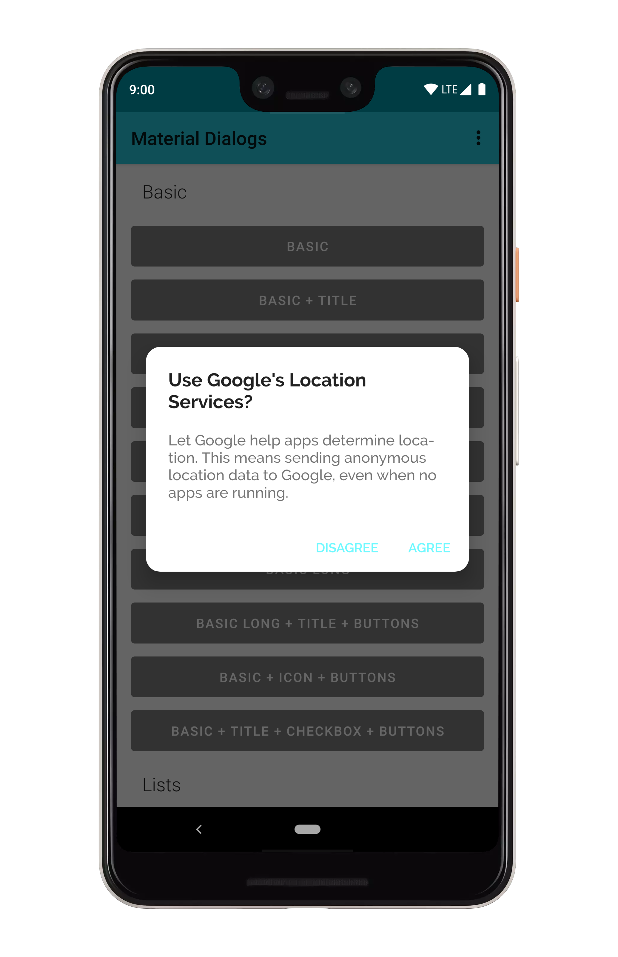
## Theming
谷歌新的主题思维方式(相对于 2014 年的思维方式)是灵活的。如果你拿他们的
["Crane example"](https://material.io/design/components/dialogs.html#theming),你看到他们
更改字体、转角舍入等。
### Light and Dark
根据应用程序的主题,自动设置明暗主题(基本上是 `android:textColorPrimary` 是更亮还是更暗):
 ### 背景颜色
Material Dialogs 在活动主题中使用 `colorBackgroundFloating` 属性的值作为 Dialogs 的背景色。你还可以在主题中使用 `md_background_color` 属性,该属性将优先使用。
### Ripple Color
Material Dialogs 默认情况下使用活动主题中的 `?android:colorControlHighlight` 属性的值作为列表项、按钮等的波纹颜色。你也可以使用 `md_ripple_color` 主题属性重写此内容。
### Corner Radius
角点半径是对话框角的舍入:
### 背景颜色
Material Dialogs 在活动主题中使用 `colorBackgroundFloating` 属性的值作为 Dialogs 的背景色。你还可以在主题中使用 `md_background_color` 属性,该属性将优先使用。
### Ripple Color
Material Dialogs 默认情况下使用活动主题中的 `?android:colorControlHighlight` 属性的值作为列表项、按钮等的波纹颜色。你也可以使用 `md_ripple_color` 主题属性重写此内容。
### Corner Radius
角点半径是对话框角的舍入:
 它可以通过应用程序主题中的一个属性进行更改。它默认为 4DP:
```xml
```
这个值也有一个编程设置器:
```kotlin
MaterialDialog(this).show {
// literal, internally converts to dp so 16dp
cornerRadius(16f)
// Using a dimen instead is encouraged as it's easier to have all instances changeable from one place
cornerRadius(res = R.dimen.my_corner_radius)
}
```
### Text Color
默认情况下,来自 ActivityTheme 的 `android:textColorPrimary` 和 `android:textColorSecondary` 属性用于对话框的标题和内容颜色。`colorPrimary` 用于动作按钮的默认文本颜色。如果你希望重写这些内容,可以提供以下属性:
```xml
```
### Fonts
这个库支持使用自定义字体,由支持库 `ResourcesCompat` 类提供支持。使用 `/res/font` 文件夹中的原始字体文件或 XML 字体文件,你可以使用应用程序主题中的属性在实质性对话框中使用它们。
```xml
```
请参阅示例项目中的“自定义主题”示例(打开主题切换器的溢出菜单)。
它可以通过应用程序主题中的一个属性进行更改。它默认为 4DP:
```xml
```
这个值也有一个编程设置器:
```kotlin
MaterialDialog(this).show {
// literal, internally converts to dp so 16dp
cornerRadius(16f)
// Using a dimen instead is encouraged as it's easier to have all instances changeable from one place
cornerRadius(res = R.dimen.my_corner_radius)
}
```
### Text Color
默认情况下,来自 ActivityTheme 的 `android:textColorPrimary` 和 `android:textColorSecondary` 属性用于对话框的标题和内容颜色。`colorPrimary` 用于动作按钮的默认文本颜色。如果你希望重写这些内容,可以提供以下属性:
```xml
```
### Fonts
这个库支持使用自定义字体,由支持库 `ResourcesCompat` 类提供支持。使用 `/res/font` 文件夹中的原始字体文件或 XML 字体文件,你可以使用应用程序主题中的属性在实质性对话框中使用它们。
```xml
```
请参阅示例项目中的“自定义主题”示例(打开主题切换器的溢出菜单)。