当HTML写得足够健壮,我们的设计将更容易适应不同的浏览环境,包括那些可以横竖屏切换的设备。虽然我们刚刚完成的宽屏幕下的布局在纵向模式下显示得很好,但在横向模式下并不合适。
我们将改变父级区块的高度来开始这种布局。
@media (min-width: 48rem) {
.hb-landscape {
position : relative;
width : 760px;
height : 500px; }
}
接下来,调整这些内联图片的大小和位置,使它们在面板的左侧形成一个新的网格。
@media (min-width: 48rem) {
.item__img {
position : absolute;
width : 100px;
height : 150px; }

#hb-landscape-01 .item__img {
top : 0;
left : 0; }

#hb-landscape-02 .item__img {
top : 0;
left : 120px; }

#hb-landscape-03 .item__img {
top : 0;
left : 240px; }

#hb-landscape-04 .item__img {
top : 170px;
left : 0; }

#hb-landscape-05 .item__img {
top : 170px;
left : 120px; }

#hb-landscape-06 .item__img {
top : 170px;
left : 240px; }
}
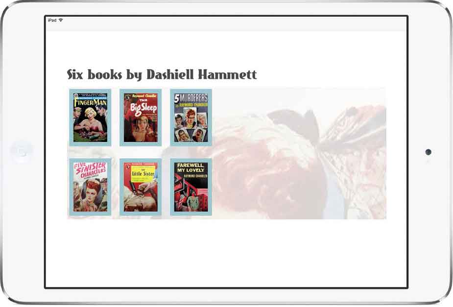
将图片布局到网格中。
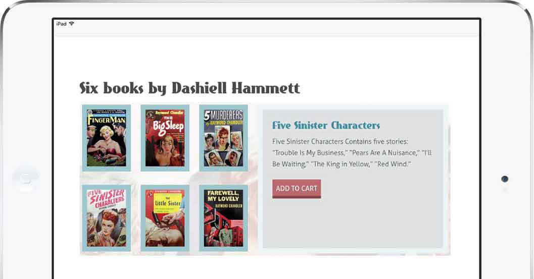
现在我们需要让描述足够小,将它们隐藏在对应的封面图后面。
@media (min-width: 48rem) {
.item .description {
position : absolute;
width : 100px;
height : 10px;
overflow : hidden; }

#hb-landscape-01 .item__description {
top : 0;
left : 0; }

#hb-landscape-02 .item__description {
top : 0;
left : 120px; }

#hb-landscape-03 .item__description {
top : 0;
left : 240px; }

#hb-landscape-04 .item__description {
top : 170px;
left : 0; }

#hb-landscape-05 .item__description {
top : 170px;
left : 120px; }

#hb-landscape-06 .item__description {
top : 170px;
left : 240px; }
}为每段内容简介设置一个比相应图片更低的z-index值,并将它们的opacity设置为0,作为过渡的初始状态。
@media (min-width: 48rem) {
.item__img {
z-index : 2; }

.item__description {
z-index : 1;
opacity : 0; }
}使用:target伪类选择器将opacity重置为0,将内容简介重新定位并调整大小,使它填满面板的右侧。增加内边距、背景色和粗边框来完善外观。
@media (min-width: 48rem) {
.item:target .item__description {
top : 0;
left : 360px;
width : 390px;
height : 280px;
padding : 20px;
opacity : 1;
background-color: #dfe1e2;
border : 10px solid #ebf4f6; }
}对于这个版本,我们将只过渡两个属性——height和opacity。
@media (min-width: 48rem) {
.item__description {
transition-property : height, opacity; }
}为每个属性设置过渡持续时间:height为0.5秒(.5s),opacity为0.75秒(.75s)。
@media (min-width: 48rem) {
.item__description {
transition-duration : .5s, .75s; }
}
提供了一个横向的替代布局。